
Managing a manufacturing environment is a complex task, and not everything goes right and according to plan. Sometimes it's helpful to have simple tools that will help you to know where to focus your energy to get the most bang for your buck. You may have heard a rule of thumb called the '80/20 rule', usually expressed as '80% of our business comes from 20% of our customers'. Well, there's a simple manufacturing troubleshooting tool that works sort of like that. It's called the Pareto Chart.
Pareto Charts
Pareto charts are an excellent tool for businesses to use to identify problems in their company. They are named after the Italian economist Vilfredo Pareto and his Pareto principle, which stated that 80% of the output of a system comes from 20% of the input. The purpose of a pareto chart is to identify this output and input, giving a graphical representation of what issues contribute the most to problems in a business based on quantifiable data. They can be used when there are many problems in a company that can be fixed, but the company wants to determine which problem is the most significant, or they can be used when there is a more broad problem and the company wants to determine what issues are causing the problem to occur.
What are Pareto Charts?
Pareto charts are a type of bar graph, with the independent variables on the horizontal axis and the dependent variables portrayed as the height of the bars. The heights of the bars usually represent the frequency with which something occurs, or cost to a company, often either time cost or financial cost. The bars are arranged by height in descending order from left to right, with the tallest bars on the left side of the graph to most easily identify the biggest problems that need to be fixed. When a Pareto chart represents all of the causes of one larger problem, a cumulative component is often overlaid on the graph as well. This gives an easy way to identify what percentage of a large problem is caused by only the most frequent causes.
How Do You Make a Pareto Chart?
To make a Pareto chart, several decisions must be made about where to focus. First, a decision must be made about what will be measured to be represented by the bars on the graph, usually this is a frequency of an event or a cost. Then, a time period of measurements must be decided on, whether it is an hour or a month of data taken, or any time period in between. Data will then be gathered either by acquiring new data or by organizing older data. To create the bars, data will be classified under different categories and summed. The heights of the bars can either be frequency or cost totals, or percentages of contribution to a larger problem, such as downtime. Proper scaling and labelling of bars and axes is then the final necessity of any graph, as it is with a Pareto chart. If there are too many categories and many bars are very small to the point of being irrelevant, an “other” category can be created to group some less significant data.
Creating the cumulative component for a Pareto chart starts by creating a vertical axis on the right side of the graph that lists percentages up to 100%, then finding the percentage of the problem that each cause represents. This step is already done if the height of the bars represent percentages of the problem. These percentages are then represented by connected dots on the graph, and cumulative sums are used for each cause to the right. For example, if the first cause contributed to 50% of the problem and the second cause contributed to 25% of the problem, the first dot would be at 50% height and the second would be located at 75% height, showing that the largest two causes were responsible for 75% of the problem.
Example of a Pareto Chart
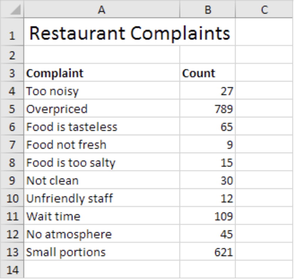
A quick example of a Pareto chart in action is the graphical representation of restaurant complaints. The data is given below, with each complaint type and the amount of times the complaint was given by a customer.
The complaint counts are then arranged from greatest to least, with the most frequent complaints on the left.
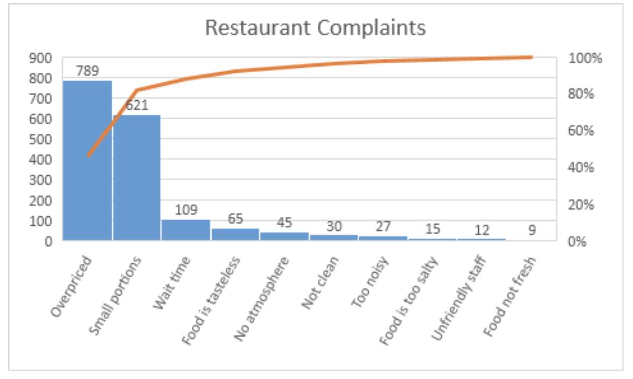
A cumulative line is also used, showing that the two most frequent complaints are responsible for over 80% of the total complaints. This graph emphatically highlights that this restaurant needs to consider reducing prices and increasing portion sizes.
See? This is a simple, no-nonsense tool that helps you and your team to focus on where the biggest problems are. Of course, this approach can still require manual work to monitor the right production parameters, collect and organize the data. Fortunately, you can leverage software to do that work for you!
To see how quickly you can get factory KPI insights, sign up for a free trial below or learn more about improving your continuous improvement program here.